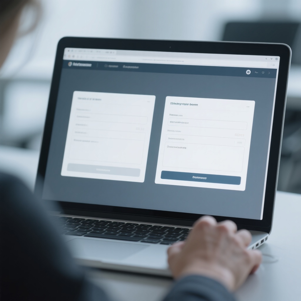
Last quarter our team ran a small experiment that started as a joke and ended up changing how we build every landing page. We took the same B2B contact form — name, email, company, message — and built four different designs around it. Same page, same traffic source, same product, four variants. Here's what the numbers said.
The Four Variants
Variant A was the classic: a form in the middle of the page, three fields visible, company and phone marked optional, a reassuring paragraph about privacy above the button.
Variant B was the "bold" one: form on the right, big headline, trust badges (SSL, GDPR, a "2,000+ companies" counter) stacked under the button.
Variant C was the minimalist: two fields only — email and message. We suspected this would win on completions but lose on quality.
Variant D was the joke: we took Variant A and changed one thing — the button text from "Submit" to "Get the price list." Nothing else. Not even the color.
What Happened
Over four weeks and 3,100 visitors, the results were uncomfortable. Variant D beat every other design on completion rate — 6.9% versus 4.1% for A, 4.8% for B, and 5.6% for C. The "joke" variant also produced the best lead quality by a wide margin: the message field had the highest average character count, and the email addresses were overwhelmingly business domains.
Variant B, with all its trust badges, converted worse than the plain form. The counter ("2,000+ companies") actually hurt us — a few visitors emailed to ask if the number was real, which is a bad sign when people are fact-checking your badge instead of filling out your form.
What We Learned
One change to one word outperformed redesigns, badges, and field removal. The takeaway isn't "button text is everything" — it's that visitors convert when they know what happens next. "Submit" is a mystery; "Get the price list" is a promise. Most contact forms on the internet are asking strangers to do homework with no payoff named.
We've since rerun the test on two client sites with the same pattern — a specific, outcome-naming button beats a generic one every time. Next we're testing whether "Get a quote in 24 hours" beats "Get the price list." Our money's on the deadline.