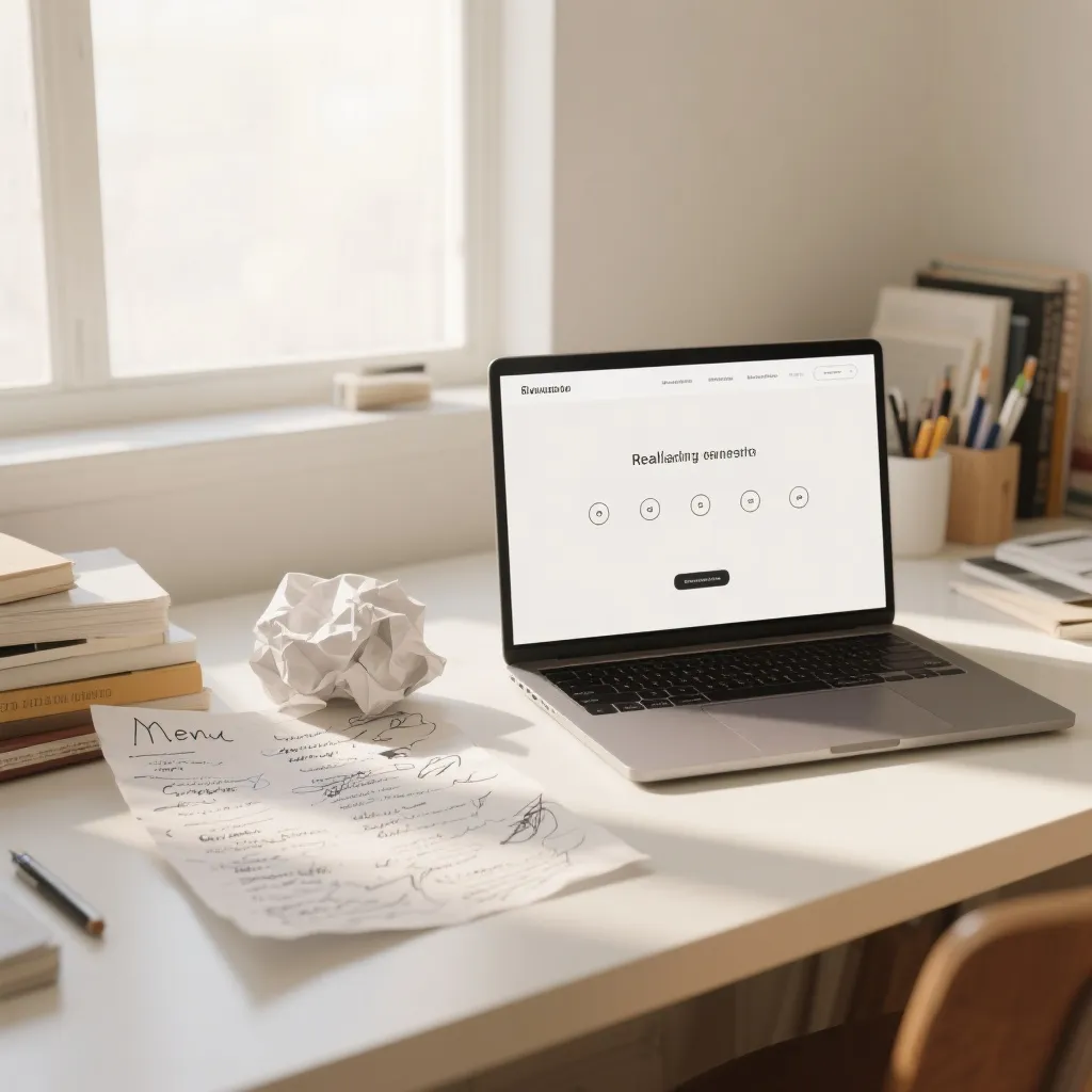
<p>Our old navigation had 11 items. We were proud of it — every product line had its own menu entry, plus About, plus News, plus Resources, plus two dropdowns with five items each. A visitor had to think to use it. Thinking is the enemy of clicking.</p><p>We know this because of a story a customer told us. She wanted to buy replacement blades. She stared at the menu for a while, couldn't tell which of the eleven things was "replacement blades," and left. She came back a month later, found us through Google instead, and told us about the first visit almost as an afterthought. That story cost us a month of sales from one customer, and we don't know how many more did the same thing silently.</p><p>So we cut the menu to five: Home, Products, About, Blog, Contact. That's it. The eleven product lines moved to the homepage, arranged the way people actually think about them — by application, not by internal department. The dropdowns died. The menu stopped being a map and became a door.</p><p>What happened: internal search usage went up 34%, because people typed what they wanted instead of hunting for it. But the number we cared about most — pages per visit for new visitors — went up 18%. People clicked more because they finally understood what the five clicks were for.</p><p>Menus are not a filing system for your company's internal structure. They're a promise: here's what you can do on this site, and it's fewer things than you think. If a visitor has to read your menu, it's too complicated. Cut it until they don't have to.</p>
We Cut Our Navigation to 5 Links. Visitors Finally Knew Where to Click
Related Articles

Enjoying this article? Subscribe to our newsletter
Get the latest tutorials, tips, and product updates delivered to your inbox.
Subscribe